
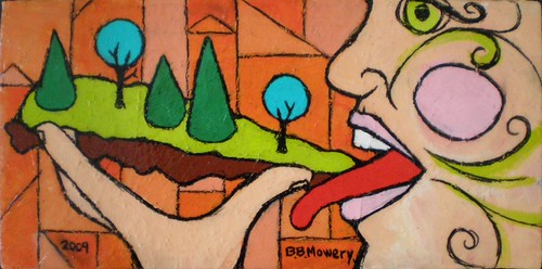
I think about painting a lot. All the time. Much more thinking than active painting. And when I'm not thinking about painting, I berating myself for not painting more. I think about it so much because painting is as much about ideas as pretty pictures. If I paint realistically from life, from observation, I do so for the sake of practice, to keep my eye sharp, to reassure myself that my hand will readily make anything I demand of it. Making a "pretty" painting not on my mind. Sometimes I am exorcising demons and never expect it to hang on anyone's wall but my own (like "Good to the Last Bite" above). And maybe not even my own wall. Sometimes an idea needs to come into being, a demon needs to be exorcised before I can move on creatively. I don't expect anyone to want a faintly Aztec deity consuming a pizza slice of forest upon a backdrop of disturbed land and subdivisions to hang in their powder room. That painting was made in response to land dispute, inspired by anger. Anger about the commoditization of 200+ years of our family history as though it means nothing, as though trees are dollar signs, as though the true value of green space is what an appraiser assigns to it.
Uh, so yeah, I'm still a little ticked off.
When I worked at the museum, I had a lot of time on my hands to think about art and to talk about it with the other assistants. (Basically paid to loiter.) One day I was explaining to Sarah that I had burnt out on singing with the church choir in Ocean City because the only appropriate way to sing for church is "prettily." There I was with my voice trained into the best tone and range and control of my entire life, and I was only using it to make pretty noises, when there are so many other interesting ways to use one's voice in the context of music. Sarah replied, "That's sort of the point of music: to sound pretty." I was aghast. If I had said the same thing to Sarah about photography (she was a high school photography teacher), that the point of it was to take pretty pictures, she might have clobbered me over the head with her Nikon. Strange that her belief that art is about ideas only extended to the visual arts and not to music. I mean, hello, John Cage!!?!?!

I digress. (It loves to happen.) I leave for Paint Snow Hill in little more than a week, so I have been thinking about painting more than usual. I go to plein air painting events for the adrenaline kick that I get from proximity to other artists and being forced to work rapidly. But to some extent by doing so I am immersing myself in a sea of painters of pretty pictures. Plein air painting has its own school of thought and rules and ideals. Folks who identify themselves as plein air painters chase after this pinnacle of painting. To me it's just one facet of painting. But I fully appreciate them and their craft. I don't really participate in it. I zig to their zag.
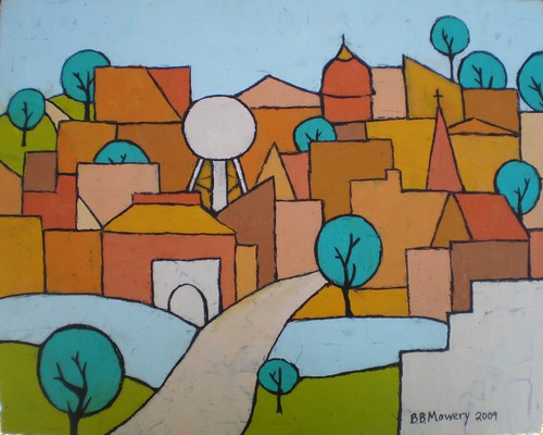
At last year's picnic another painter, an older man, asked my why I decided to paint the Town of Snow Hill like this. He was mystified, perplexed, especially by the lollipop trees. How to explain to him that this is how it lives in my mind? That photorealism matters little to me? That I would rather convey what it "is like" than what it "looks like"? Snow Hill is a claustrophobic collection of brick storefronts and steeples and ancient trees, nestled against the river, with farmland both to the north and south. So that is what I painted. That was not how he chose to paint it. And if you paint, it is probably not how you would choose to paint it. I hope that you paint what your world "is like."
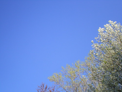
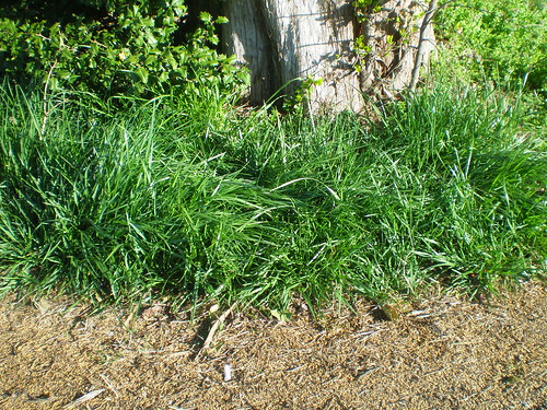
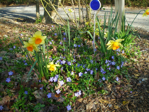
The rest of this post is written assuming that you also paint or would like to. In my outdoor painting tutorial I mention paring down one's painting supplies so that they are more portable. But how to decide which paints you might need for an outdoor painting excursion? You will do well by scouting the area in advance to take note of predominant colors in the subject landscape. I made a springtime color study of my neighborhood as an example.
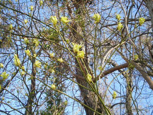
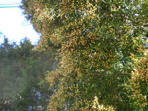
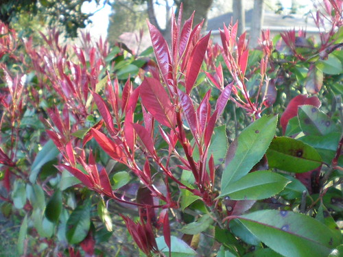
But I would not recommend using a camera for your scouting expedition. Your eye and general impressions are more important than any digital image you might capture. The camera is its own editor, and accurate color memory is a difficult skill even with practice.
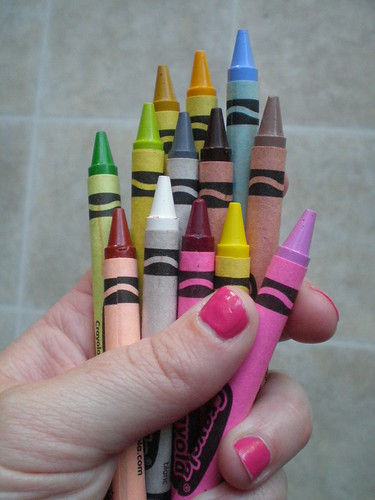
Instead I suggest you take a big box of crayons. Seriously. Just pull out the predominant colors that you see around you. Here's what I saw while walking the dog. Once you are back home with a handful of crayons and all of your paint tubes in front of you, it's time to decide which ones you will need for painting out-of-doors. You will definitely need your core paint colors:
+ Titanium White
+ Cadmium Yellow (cool)
+ Ultramarine Blue (warm)
+ Pthalocyanine Green (cool)
+ Napthol Crimson (cool)
+ Mars Black
With those six tubes of paint you can mix almost any color you want. When deciding which other paint colors you will need, your main consideration should be speed. Plein air painting is all about painting quickly to capture a particular moment in time. First, set aside any crayons in your hand that might be very close to your basic paint colors, like white, green, yellow, and crimson. Now consider the remaining colors. Some will be very easy to mix quickly, like pink and grey. Others colors, like the light green-yellow, might be easy to mix, but when you find yourself making it over and over and over again, it is probably time to purchase a tube of that paint color. Especially true if one of the main components is Cadmium Yellow--a little more expensive than average. This is a good rule for ancillary paint purchases: buy a color only if you are constantly mixing to make it. Looking at my handful of crayons and reckoning my skills as a paint mixer, I would add these tubes of paint to my outdoor stash:
+ Burnt Sienna - the reddish brown of fresh turned fields (warm)
+ Yellow Ochre - for an earthy, warm yellow color (warm)
+ Brilliant Yellow Green - to save my cad. yellow supply (warm)
+ Light Ultramarine Blue - because I am supremely lazy about making light blue for no good reason (warm)
Then I would discard the Mars Black and replace it with Burnt Umber (cool brown) because Burnt Umber is more versatile. It can be mixed with Ultramarine Blue to make black if I need it. And that creates a black paint with more depth and visual interest anyway.
So that's how I would go about selecting colors for outdoor painting. First, start with six core colors. Second, scout the subject area to see what colors are predominant. Third, make additional selections with speedy mixing and volume of use in mind. You just set up your outdoor painting kit. Tada!
* The title of this post borrowed from the lovely and talented Mr. Stephen Morrissey. Indeed one of the first things I loved about Robb was that he loved The Smiths. "I am now a central part of your mind's landscape, whether you care or do not. Yeah, I've made up your mind. The more you ignore me, the closer I get..." *total swoon*
No comments:
Post a Comment